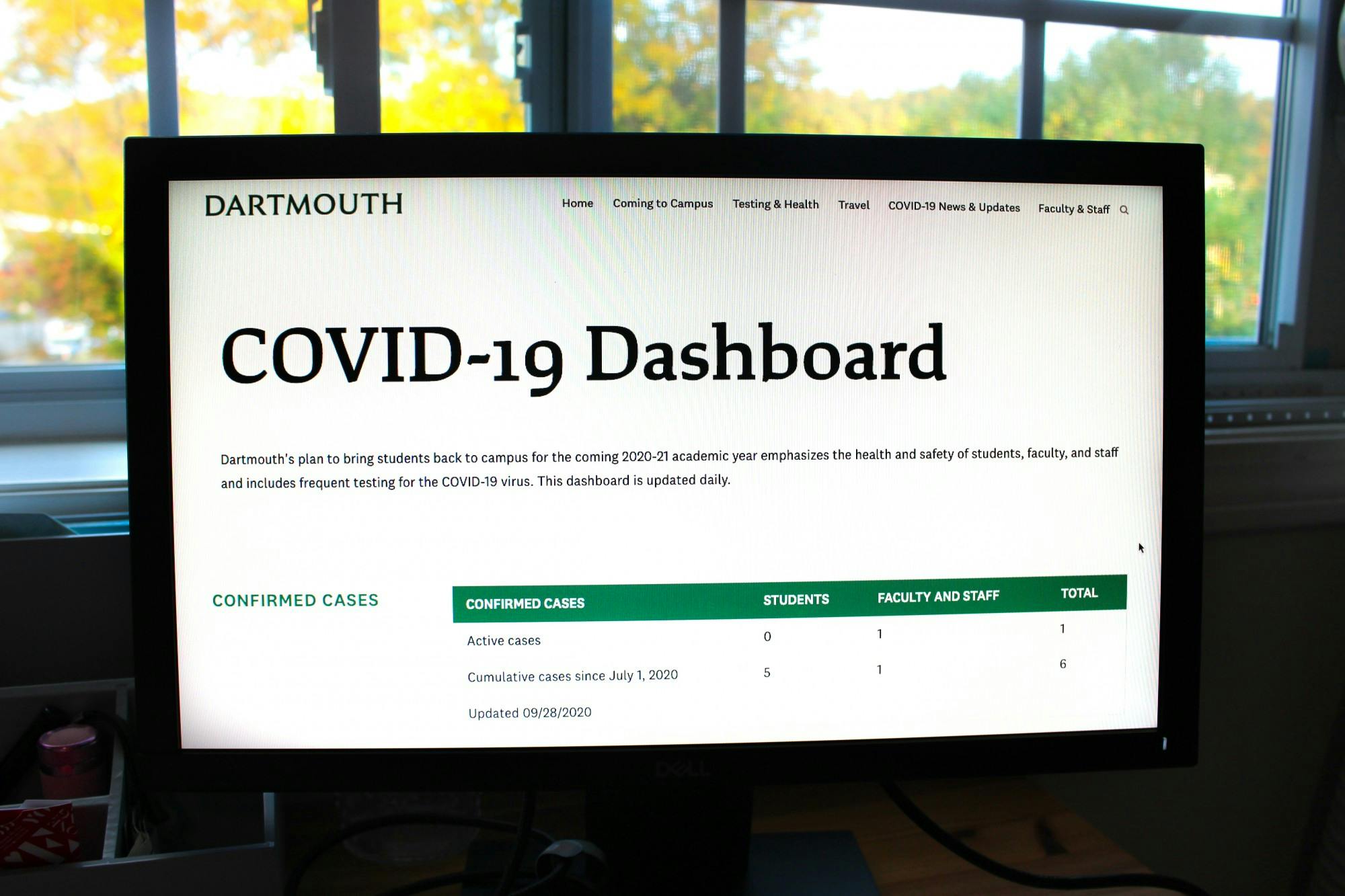
While Dartmouth’s reopening has so far gone smoothly with only six cumulative cases since July 1, the College has identified certain key benchmarks for when it may need to reevaluate its reopening plan. Since its debut ahead of students’ return to campus this fall, the COVID-19 reporting dashboard has allowed the Dartmouth community to follow relevant testing, quarantine and isolation data.
Among the key considerations for reevaluating on-campus operations is the rate at which cases are increasing, according to COVID-19 task force co-chair Lisa Adams. Another widely cited indicator is Dartmouth’s one percent positive test threshold, meaning that if the number of active cases reaches one percent of the testing cohort at any time, the College may reconsider parts of its reopening plan. A one percent positivity rate for the College’s testing cohort, which comprises mostly undergraduates, would prompt immediate review of the current in-person operational status, according to an Aug. 26 email to campus from College President Phil Hanlon.
Adams said, however, that the one percent threshold is not a definitive benchmark for closing campus.
“The one percent positivity rate is not an on-off switch,” Adams said. “It has been acknowledged as a key indicator that we will follow, but we have multiple key indicators that we are following.”
Adams noted that if there were to be an outbreak on campus, it would be important to look at different sectors of the campus population, breaking up case counts and positivity rates into groups like “on-campus, off-campus, graduate and professional, undergraduate [and] where students are living” to fully understand the situation.
During the Aug. 5 “Community Conversations” livestream with Provost Joseph Helble, Adams said the College’s decision to set the threshold at one percent took into account Dartmouth-Hitchcock Medical Center’s ability to treat students, national and local case numbers and the number of students who need to be quarantined.
She said that the nature of the College’s positive cases will be critical in determining whether to send students home. According to Adams, if the positivity rate rises gradually or if most of the cases are linked to one another, surpassing the threshold will be much less concerning.
She added that the College’s peer institutions have set thresholds in the “same ballpark.” Cornell University, for example, announced that it would consider closing campus if there were 250 cases in a single week, a figure that represents around one percent of its student population.
Dartmouth’s current COVID-19 dashboard has several tables depicting the numbers of confirmed cases, tests performed in the aggregate, tests by week, quarantine and isolation occupancy and pre-arrival tests. The newest table — “Testing by week since July 1, 2020” — delineates trends in case numbers with columns for the total number of positive cases, total tests and the positivity rate for a given week. As of Sept. 17, the dashboard has been updated daily. Previously, the dashboard was updated on Mondays and Thursdays.
David Kaufmann ’23 said that while the dashboard “definitely has all the information that you would want,” he wishes that he could find that information more quickly through graphs and other data visualizations rather than tables. The current dashboard contains one graphic — a pie chart showing the percentage of quarantine housing currently occupied.
“When you just glance at it, you definitely have to read through the descriptions to figure out what each different section is in terms of how they’re defining quarantine versus isolation and stuff like that,” he said. “... It just takes a little bit more time to see [because] it’s not immediately obvious.”
The New Hampshire Department of Health and Human Services receives data from the College for its own dashboard, which requires identifying information like address, sex, race and ethnicity, for all positive cases. However, Dartmouth does not disclose this information on its own dashboard.
“We strip the identifiers when we provide data for reporting on our dashboard,” Lawrence wrote. “All patient-level data is [Health Insurance Portability and Accountability Act]-protected.”
Any College-provided COVID-19 tests — processed through the Broad Institute of the Massachusetts Institute of Technology and Harvard University, DHMC and Vault Health, according to Lawrence — are displayed as “positive tests” under the “testing since July 1” table. The “confirmed cases” table contains data on positive tests confirmed among students, faculty and staff administered anywhere in New Hampshire since July 1. Pre-arrival testing numbers are only included in either table should the student have taken a test in the Upper Valley.
Quantitative social science professor Robert Cooper said that, at the current moment, it is more important for COVID-19 dashboards to visualize the changes in case numbers than to visualize total case numbers. Johns Hopkins University’s global COVID-19 dashboard, which Cooper said is “one of the most famous data visualizations of [his] lifetime,” utilizes a bubble plot that depicts case density across the world, but now that cases are no longer scarce, he said that the dashboard fails to highlight daily or weekly variation in the data.
“When you go to the Johns Hopkins dashboard now, you basically see red blobs everywhere because there are so many cases all over the world,” Cooper said. “You can’t get any meaningful data out of it besides that there are a lot of cases, and we already know that. A visualization should highlight a daily, weekly or monthly change rate.”
He added that he thinks a map visualization such as Johns Hopkins’ would be ineffective at the local level, but noted that a bar or line plot depicting change would work. While Dartmouth’s “testing by week since July 1” table is functional, Cooper said he believes people interpret visual data better than tabular data.
The College’s COVID-19 dashboard has undergone changes since its inception, including, most notably, the elimination of daily testing numbers and case counts. While Madeleine Bernardeau ’22 said that she appreciated the addition of the “testing by week since July 1” table, she felt some of the alterations made the dashboard less user-friendly.
She explained that the dashboard used to employ more colors and vary its depiction of data, adding that she preferred a bar graph that was displayed on the dashboard earlier this month to the current tabular format. The bar graph indicated the total number of confirmed cases, the daily number of positive tests and the daily number of tests performed.
Kaufmann, who is set to be on campus for the winter term, said that he has been monitoring the dashboard to ensure that his plans for the winter do not need to change. He said that being able to compare Dartmouth’s positive case rate with the positive case rate for all of New Hampshire using the link in the “State Testing and Confirmed Cases” section of the dashboard has been “helpful.”
“If things are just going really poorly for the first three or four weeks of fall term, I probably would just start making plans to not be on campus in [the] winter,” he said. “I feel like if we were nearing the New Hampshire positive rate, then it'd be like, ‘Oh, we're not doing particularly well,’ … but considering that our numbers are so much lower, we're doing something right.”
Lauren Adler contributed reporting.