Spring Term in Graphs
It was a long time coming, but spring has finally sprung. This past week, there was an exponential increase in the number of people hanging out on the Green. And that got me thinking: How can I capture spring term at Dartmouth in graphs? I may not have known how to graph Canada’s production possibility frontier on my last Econ midterm, but I think I figured out how to map these more relevant trends (sorry, Canada):
"Class Half Full"

There’s a pretty good chance that you’re taking at least one of these classes this term. Did you follow the crowd for an easy A, or are you bracing yourself for academic rigor’s next blow to your GPA?
"Spring Term App Usage"

Dartmouth’s app usage doesn’t diverge much from normal in the spring, although I’m pretty sure I’ve already checked the weather app more this term than I ever did in the winter.
"Spring Term Liquid Diet"

I may be the only one who actually goes to The Swirl & Pearl for bubble tea on a regular basis (often enough that I should really invest in a punch card), but it looks like most students’ beverage choices change in the spring.
"Step Outside"

There are so many opportunities at Dartmouth to hike, canoe and just generally enjoy the outdoors. Spring is the perfect time to get outside and moving, but have you really done anything crunchy since Trips?
"ID Rather Not"

We could probably make a histogram plotting how many times we each lose our Dartmouth ID during undergrad. But in the meantime, keep an eye on your ID – you need it more than ever now that they guard the gym like it’s Area 51.
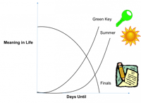
"The Final Countdown"

Green Key is the light at the end of the dark, dark academic tunnel. We look forward to it not just the entire term but the entire year. Unfortunately, the Green Key high quickly subsides with the coming of finals period. You’ve been warned.

